Thursday, February 19, 2009

Assignment 2


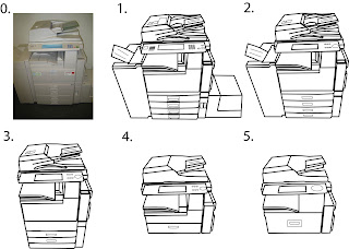
For this assignment, Illustrator's pen tool was used in tracing the details of the photocopier.

Initially, all lines were of size 2, but with Alfred's advice, details such as the handle and buttons of the photocopier were changed to size 1.

I chose this particular picture of a photocopier as I felt that it would be easier to do the reductions if there was a lot of details. However, I soon learnt that it was not an easy task to do, with that many details in the picture. It did give me a lot of room to reduce into my final pictogram though. As the reduction steps went on, it became easier for me to take out unwanted/redundant details, as I had many details available for deletion.

One problem I encountered was when I had traced entire frames in one stroke using the pen tool. This led to problems during the reduction process, as portions I wanted to delete could not be deleted. I learnt that for future illustrations, it would be better to tackle complicated outlines using several lines instead of one.

I also learnt that Flash was an easier programme when illustrating pictograms as it allowed easy manipulations of lines drawn.

Comments given were that a lot more reductions could be done in the 4th and 5th step. This was where I felt that the photocopier was starting to look like a printer instead of a photocopier. As such, I decided to work on reduction 3, choosing to reduce the illustration further.


The final pictogram is as follows. White outline was used for the details of the photocopier, while a black fill was used for the body of the machine.

Sunday, February 15, 2009

Assignment 1


The sketches done were based on 2 things - aikido, as well as my love for music. The left top panel is actually a sketch based on the manipulation of my aikido belt to form my name. The bottom left panel is of little aikido men in their uniform, using their hands and legs to spell out the letters of my name.

The right panel are sketches of the wires of my earphones, twisted to form the letters. They are somewhat similar, except in the bottom left, I added another "layer" to make the wires look more realistic.


I decided to go with the wires as my rough, as I decided that I love music more so than aikido. In the roughs, I added in my iPod touch, so I could have the wires coming out of the player rather than it lying on a surface by itself, which would look kinda weird.


Based on the roughs, I worked on my prototype (?) with Illustrator and came up with this. The iPod was done with the help of the standard shapes, while the wire was done using the Pen tool. The anchor points of the Pen tool allowed me to curve the letters of my name at certain points to create a more realistic look of wires twisting. I also added the shadow effect to make it look as if the player is lying on a flat surface. A background was created because I needed to make the wires stand out, as it was quite camouflaged without one. Again, making use of the rectangle and star tool, I blended the two shapes and it came out looking like this. I wanted to go with the reasoning that music adds colour to our life, which explains the colourful background, which however, had the opposite effect unfortunately

Comments received from the class was that the background was too complicated, and that the star took away the focus of my name. Mr. Low suggested removing the star, and also making part of my name appear in the player, such that the screen (the grey space) was not wasted.

This is the revised version:


Following Mr. Low's advice, I made my name appear in the screen of the player, adding a bit of a glowy effect. The rest of my name comes out from the wires, with the ear pieces resting on the side. This time round, I used the paint tool to draw out my name, but it was quite difficult doing this with a mouse. But after several tries, I got something that I was satisfied with, which was this. Instead of a complicated background in this revised version, I went with a simple one, mainly so the white wires could be seen when printed out on paper. It still looks simple, but I think I remember it being said in lecture that it is better to be simple? haha.

Comments are much appreciated. :)

In Class Assignment 1 - Creativity Machine


I wanted to go for something simple in drawing the creativity machine, so I came up with a hat that somewhat resembles a dog.

The reasoning is simple - the eye on the hat looks around the surroundings of the person that wears the hat and takes whatever it sees and turns it into "creative juices". The meter on the left will blink and sound if it reaches the maximum.